Whether you’re in the business of trading stocks, forex, or commodities, then you’ll be used to looking at charts. The world of cryptocurrency is no different from any other kind of trade.
How the charts look for any given currency or asset is very much dependent on the behavior of other traders. When the price dips, people start selling. When people start selling, the price drops even further. The opposite is also true; rising prices attract more buyers, which in turn pushes the price upwards.
Seasoned traders will keep up with the news surrounding cryptocurrency to see which way the market is headed. But what if you’re not an experienced trader and are just trying to wrap your head around it all? Well, read on.
Understanding Bitcoin price charts
There are two different kinds of graphs you should be familiar with to make any predictions.
Line chart
The most common price chart you’ll come across is a line pricing chart. It’s a simple chart that shows you the fluctuations in value over time, compared to a standard currency like USD. The period can be anywhere from the past hour to the beginning of time. Most line charts include 1 hour, 12 hours, 24 hours, one week, one month, one year, etc.
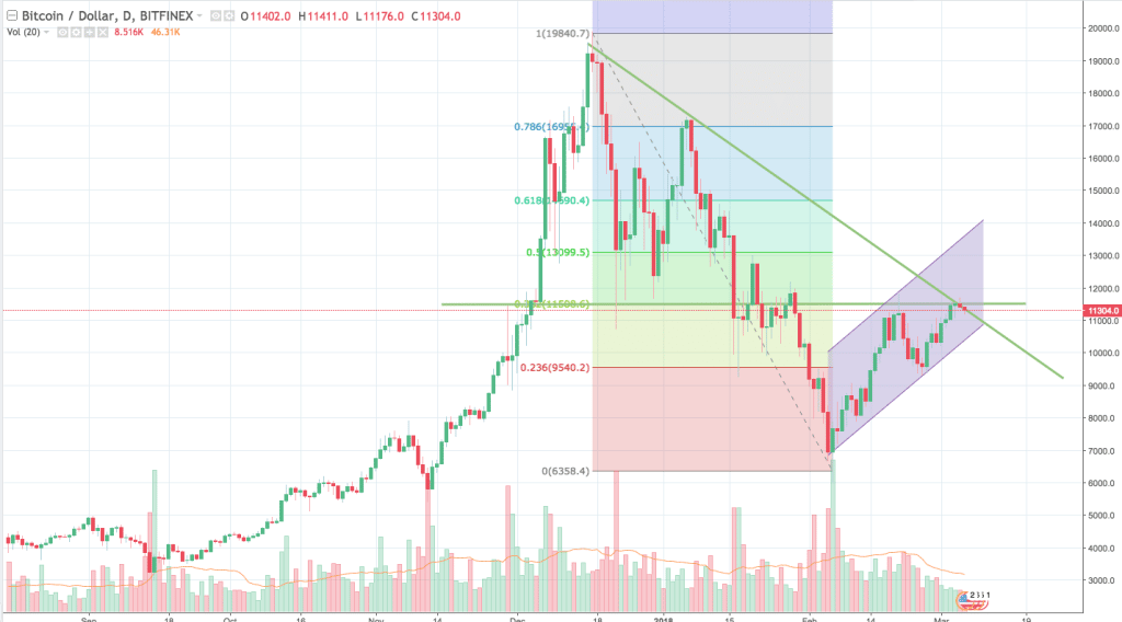
Candlestick chart
The candlestick chart is the experienced trader’s tool of choice. As the name suggests, it resembles a candle. The candlestick shows the price, the market cap, and the trading volume of Bitcoin. Furthermore, you’ll be able to see the highest and lowest prices in a given period, as well as the opening and closing price.
Where to find Bitcoin price charts
You’ll see line charts on every exchange and most wallet providers. There are, also, several other websites dedicated to keeping you up to date on the price fluctuations.
How to read Bitcoin price charts
You know what the charts look like and where to find them. But how do you make sense of them?
Line charts
The line chart is pretty straightforward. You can see how the price has fluctuated over time and can see the general trend. The table will reveal the current stability of Bitcoin, and give you an indication of what’s to come.
Candlestick charts
The candlestick chart will be green for bullish markets (price went up) and red for bearish markets (price went down). This kind of table will give you more detailed information than you’d get from a line chart.

Long-term vs. short-term trading
You should bear your trading strategy in mind when using Bitcoin price charts. There will be a big difference between short-term margin trading and long-term “hodl’er” trading.
What to do now
Play around with some of the charts available on the web. The more you look at them and familiarize yourself with Bitcoin’s movement, there more it’ll make sense. The line and candlestick charts are by no means your only options. There are a wealth of different charts and graphs to work with. Experiment with the various options to find the one that suits your trading style.